01/03/2014

PropertyStream

We are ambitious and always looking towards innovation to drive our business forward and provide a quality service. As the business expands, 22 Group are growing their team of dedicated and skilled staff, scouring the local talent.

We are strong believers that in order to grow, you have to look to the future. Having worked with numerous property companies such asEweMove.com and Knight Frank, we saw the opportunity to use the experience and the technology we had developed to expand our business.

The "traditional" image of an estate agency is being well and truly diluted, following a change in customer needs during the last downturn in the economy.

It was this issue and demand from estate agents in their varied forms and structures, which led to the design of PropertyStream. Created in consultation with some of the country’s leading estate agencies, PropertyStream is flexible enough to be adapted to individual agencies’ needs and structures.

PropertyStream has all the features estate agents need to run a modern estate agency. And helps set them apart with award winning creative website design and marketing.

Launched in March 2014 following a targeted multifaceted marketing campaign, there has already been an overwhelmingly positive response.

One problem we noticed from our initial market research was that no one is listening to Estate Agents nothing services them completely.

To ensure we’re always pushing ourselves we have invested in a continual market research campaign talking to agents across the country about their problems and what we can do to fix them.

02/12/2013

Working to make EweMove.com best in show

Having successfully designed the website and distinctive brand-style for Ewemove.com, the UK’s first choice selling and lettings agent, we faced a new challenge. Their offer of special business relationships was being promoted at the highly competitive National Franchise Show in the Birmingham NEC. So the 22 team created a stand that would definitely stand out. We matched this with an attention-grabbing Customer Brochure, Franchise pack, Facebook App and an upgrade of their website. Altogether it ensured that Ewemove.com was a showstopper.

Robin Arnold, 22's Creative Director, comments: "Working with such a forward thinking company is both inspiring and enjoyable. We have helped build the brand and it is incredibly rewarding to see the team’s creative and technical work being showcased on a National level."

Glenn Ackroyd, co-owner of Ewemove.com adds: "22's amazing stand design, 'hot off the press' customer brochure and Franchise prospectus oozed credibility and professionalism. And the results speak for themselves. Ewemove.com achieved five times more expressions of interest than we’d been told to expect."

Glenn Ackroyd, EweMove.com – Halifax

14/08/2013

Letting agency welcomes their fresh new look

Top North West Lettings Agency McDonald Property has opened their doors to a bright new brand refresh applied with taste and skill by Manchester-based design agency 22.

The new branding combines vivid friendly colours and homely images to evoke the welcoming service that McDonald provide to their tenants and landlords. It has been successfully applied to the website, marketing materials, and within the agency’s two offices in Blackpool and Cleveleys.

Robin Arnold, 22 creative director, says: “We felt that the lettings agency sector was awash with brands that were stuffy and old fashioned, and it was important to create something friendly, memorable and contemporary. After all, even if you are renting a property, it is still very much your home. Things like an inviting sofa, a pair of fluffy slippers, family picture frames and your pet cat convey feelings of homeliness, security and a sense of belonging.”

The new look follows the acquisition of McDonald by shared ownership specialist RHL, a subsidiary of the Regenda Group, in December last year.

Louise Douglas, Head of communications at the Regenda Group comments: “The new branding by 22 gives a fresh clean image to McDonald and builds on the friendly, knowledgeable and professional service that McDonald is known for.”

15/07/2013

A stylish make-over for an online estate agency site

Self-Sale.com is a very smart idea that needed a very smart website. They are an online estate agency offering a complete service for 0.5% +VAT but 22 gave them 100% in refreshing and refining their unique estate agency website.

We've had a very successful partnership since 2007 when 22 created their brand identity and we've been constantly helping them build their brand ever since. Our new look includes more emphasis in providing valuable property advice to their clients.

Steve Butt, a partner in Self-Sale.com comments: "I can always rely on the guys at 22 to give me total commitment and the most eye-catching site in my market"

Robin Arnold, creative director of 22 says "we're always keen to work with innovative, customer focused companies like Self-Sale.com and we're equally delighted with the end result".

14/07/2013

EweMove.com is sold on 22

When the UK's most innovative property group needed a new website design they naturally first viewed then moved to 22. Having re-branded themselves as EweMove with a distinctive 'sheep' logo they wanted a website that was as cool and witty. We not only gave them a strongly branded fresh 'natural' look (miles away from the traditional, cluttered 'letting agent' style) but we also 'branded' the language. So, 'Ewe could could find a property that was best of breed', 'their service was ewe-nique' and 'they were the best property group - baa none' Robin Arnold, Creative Director of 22 says,"EweMove have been great partners in encouraging us to create a website that's as distinctive and innovative as they are and we're now repeating this style in their promotional literature. They've been baa-rilliant"(see it's catching)

Check the site out www.ewemove.com

06/03/2013

Morrissey & The Smiths by Kevin Cummins.

We have been helping our friends at Manchester photographic with their online marketing for an exhibition of photos of Morrissey and The Smiths by Kevin Cummins.

Manchester photographic is Manchester’s only independent photography school with its own professional school, studios, gallery and conferencing facilities. They work with some of the UK's most respected photographers and hold regular exhibitions of their work.

Kevin Cummins is one of the coolest photographers working in the UK. He is probably most famous for his photographs of rock bands including Joy Division, Manic Street Preachers, Sex Pistols, R.E.M., U2, The Smiths, and Oasis. Thursdays exhibition showcases his iconic photos of Morrissey and The Smiths.

The opening night of the exhibition is on Thursday 7th March,  between 6-9pm, Unit 5, Sevendale House, Lever St, Manchester, M11WD. 

The after party is just around the corner at the 'The Northern' pub on Tib street. If you are interested in coming along get in touch with Andy from Manchester Photographic on rsvp@manchesterphotographic.com.

23/02/2013

22 revive Key youth charity brand and website

We are chuffed to bits to announce the launch of the Key youth charity branding and website! Thanks to the team for all of their hard work and thanks to Key for being such a cool client.

We were asked to reinvigorate and refresh the look and feel for the youth charity Key. Their tired brand identity and website didn’t fully represent them as a charity aimed at young people.

Key is an amazing charity that provides housing support to young people up to the age of 25. Offering a variety of services including mediation, support, mentoring and counselling, it was imperative that their target audience could instantly connect with the brand; moreover to actively encourage them to get in touch and not immediately dismiss Key because of their outdated design.

Director of Key, Ursula Patten had a clear vision for the brand: “Key decided to update its identity as although our black and white Key was well designed and had been used for a long time, a number of young people had commented that it was boring and austere."

“We were looking for something to reflect that we are young person focused. We wanted something more colourful and more vibrant. We were delighted with the new logo - it was bright and simple - we felt that it wouldn’t date. This was the starting point for the redesign of the website. The old website was very static and one dimensional and again didn’t reflect Key’s ethos.”

Through clever use of typography we created a modern and engaging logo with subtle reference to the shape of a ‘Key’. The bright colour pallette, angular typography and photos of service users created a distinctive and memorable look that genuinely conveys Key’s message.

Key’s core requirements for the site were to appeal and convey vital information to young people who need help, and to also shout about the great work it is doing in order to fundraise and attract volunteers. These were also fulfilled by developing two clear routes through the site by using compelling graphic design.

Patten and the board of trustees were delighted with the end result and our collaborative approach: “We chose 22 as a number of our trustees had seen previous examples of their work. We were impressed by their professionalism. It helped that the staff put in the time to work with the board of trustees and took them through a number of design options and the thoughts behind them."

“The website design element felt like a two way process with Key’s thoughts and ideas fully incorporated. It is no easy task to build a website that will please all those involved, but 22 have been patient in ensuring that this happens. We are extremely pleased with the result. It doesn’t just look like any other website. It is bright and engaging.”

It was great to work with a charity that gives so much back to the youth community of today, it made this project so much more meaningful. It’s a privilege that our designs and strategic positioning of the brand will help young people to get the assistance that they need.

23/02/2013

The cream of superlogos

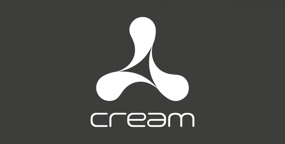
This months Superlogo is one of my personal top 5 favourite logos of all time. It was the marque that epitomised the crème de la crème of superclub branding in the 90's, the world famous spinning propeller — The Cream nightclub logo.

It may not have the historical baggage of some of the logo superheavy weights, but when it comes to elegance and form it is up there with the best of them.

20 years after it's inception the logo itself still looks as fresh and ultra modern as ever. In fact I would go as far as to say that I can't see this marque dating any time soon. The typeface maybe — but not a beautifully simple shape such as this. This is another example that simplicity tends to equal longevity when it comes to logo design.

If you don't already know, "Cream was the club that turned a dusty warehouse into the country's most popular dance-floor, that got people to queue through Liverpool's streets hour after hour and inspired students to apply to the city's universities in their droves. Cream then staged its first event in Ibiza in 1994 and continues to host one of the biggest club nights on the island at Amnesia, and has become the longest running UK Club night to stage events on the party isle. With Ibiza's cosmopolitan crowd the Cream story soon began to spread around the world and the company was soon organising events in places as varied as Buenos Aires to Moscow. The company now stages over 100 events annually and its international activity has gone on to become one of the company’s greatest achievements." Emma Johnson

It has booked stars like Kylie Minogue, made household names out of men who played other people's records and the lovely logo is recognised the world over.

The creative genius behind the Cream logo and branding was Rob Petrie. Here is a fascinating quote from the man himself:

"In 1993 I was a designer at Farrow when we were commissioned by Darren Hughes and James Barton the founders of Cream to design a logo for them. The brief was pretty loose but I remember Darren saying something like making it look ' classic like the Nike logo'. The early logo ideas were very much coming from the influence of Japanese car manufacturers logos - Toyota and Mitsubishi, where the logo is constructed of three interlocking elements that create the unified whole. As I then started using drop shapes referencing the actual name I was also trying to create something that was more organic yet had a subtle timeless strength to it, the Yin Yang symbol being an unlikely inspiration. When the final logo design revealed itself it was pretty obvious it was going to be the one that was chosen.

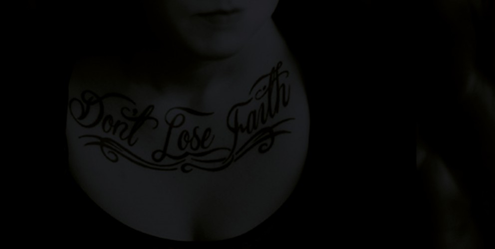
After featuring it on full page ads in pages of The Face, Ministry and Mixmag magazines it then featured on it's first CD sleeve 'Cream Live' - which was produced in five different colours of rubber. At this point I saw what was for me the most memorable incarnation of it as a 10cm high tattoo on a sweaty clubber on the dancefloor at Cream. Not sure how he'll explain that one to the grand kids.

In 1995 myself and fellow designer Phil Sims set up Dolphin Design as Mark (Farrow) left to form Farrow Design as we now know it. We continued with the Cream ads giving life to the logo and showing it's versatility by having it photographed made out of chrome, made into a snow dome, made of flowers, made into a leather chair etc. Around about this time we were quite often approached with the brief of 'can you give us something like the Cream logo you did?'

We also started creating the ads and sleeves for Renaissance nightclub, a competitor to Cream, featuring a whole range of natural objects - eggs, butterflies, flowers and leaves. Probably the most memorable campaign was the sleeves and posters was for The Mix Collection 4 which featured 3 different coloured leaves." Rob Petrie

The beauty of such a simple but distinctive marque is that it is extremely versatile. So versatile in fact, Cream have used the logo in one form or another in most of their marketing materials for the last 20 years. The logo has metamorphosed from leather chairs, to futuristic 3D graphics. From tattoos to teeth braces. In whatever guise it appears the marque is always instantly recognisable.

As you may have gathered I was bang into dance music and often frequented Cream back in its hey day in the mid 90's. So for a design student into the scene, the Cream branding and in particular the legendary Cream and Renaissance flyers were a huge inspiration for me and helped to mould my own design style.

Robin Arnold — Creative director

10/01/2013

Superlogos

Over the next few months we are going to be listing our top 10 favourite logos of all time.

We are starting with an absolute corker, the one and only British Rail logo. OK, this maybe not be the sexiest marque you have ever seen but it has the stats of an absolute Top Trump.

When it comes to longevity it gives Cliff Richard a run for his money. It just keeps on going and going...in fact the logo, first commissioned in 1965, is still being used in 2013! Long after the demise of British Rail the marque is now used on traffic signs throughout the United Kingdom.

"In 1964 the Design Research Unit—Britain's first multi-disciplinary design agency founded in 1943 by Misha Black, Milner Gray and Herbert Read—was commissioned to breathe new life into the nation's neglected railway industry, the corporate image of which had remained largely unchanged after its nationalisation in 1948, a reflection of a largely disjointed and out-of-date transport system. The company name was shortened to British Rail and Gerry Barney of the Design Rearch Unit conceived the famous 'double-arrow which represents two tracks, heading in different directions, and crossed by stylised points." - Nick Jobs

There certainly aren't many logos out there that have lasted longer than the company they were originally created for! Here are some great articles about the history and application of this branding gemstone.

http://www.doublearrow.co.uk/

http://www.guardian.co.uk/artanddesign/artblog/2006/dec/12/everydesignthebritishrail

19/12/2012

Flying retro

As some of you may or may not already know we have a bit of penchant for retro design. The standard of typography, and photography on some of our favourite 60's / 70's poster designs is in a class of its own. Their purest simplicity makes them timeless masterpieces that look contemporary 40 years after they were crafted.

Whether or not you are fan of Swiss typography and well structured grids, you can't deny this is why the posters look so fresh and modern in 2012.

Some of our favourites include Ivan Chermayeff’s beautiful but uncompromising, Modernist Pan Am Airlines adverts. Here is a great article about the story behind them. http://bit.ly/Tyk5tt

And the incredible design legacy left behind by Otl Aicher's identity system, iconic posters and highly influential imagery for the 1972 Munich Olympics. http://bit.ly/U8fr6w  http://bit.ly/Tyk5tt

I only wish the legacy had reached a little further and touched the orchestrators of the London 2012 Olympic identity. But don't get me started me started on that! That's another story... if only Otl had been on the case in 2012!

And last but certainly not least, the master of all grids, Josef Müller-Brockmann http://bit.ly/V6v4ML

He is perhaps the most well-known Swiss designer and his name is probably the most easily recognized when talking about the period. His incredible obsession with grid systems goes to the point where he includes in his book aptly named the 'Grid System' a grid layout for arranging furniture within a room. http://bit.ly/Tyq4OU

Mr Muller, we will definitely keep this grid in mind for the new 22HQ layout!

17/12/2012

5 great apps for online collaboration

The web is packed with useful apps to help businesses these days and at 22 we love to make the most of them.

The mighty Google have created an integrated app suite which makes collaboration and getting common business tasks done super easy, so we thought we should share them with those who haven’t heard of them or not tried them before.

Google Docs

Imagine you have a team of people which need to have access to the same documents and make changes in real time to those documents. Well, Google Docs allows you to do just that. We found it particularly useful when collaborating on the writing of our business plan.

Learn more

Google Calendar

An essential part of any business, a calendar should enable you to keep track of tasks that need to be carried out, upcoming events and who is involved. Google Calendar performs these tasks brilliantly by making the setting of tasks, events and reminders really really simple. As with all Google apps, colleagues can be given the power to make changes or view the calender independently and create their own calendars which can then be integrated with the main company calendar. We’ve set our browser homepages to the Google Calendar so we are easily reminded of the tasks and events ahead.

Learn more

Google Drive

Google Drive enables a team to share assets online via an web based interface and also an offline desktop application which updates when the online drive is updated. This means that wherever you go you can have all of your useful digital assets at your fingertips. We find it particularly useful for storing our company documents and website project assets.

Learn more

Google Sheets

Google Sheets as the name suggests, is a web based and feature rich spreadsheet application. It’s really handy for keeping accounting information, keeping track of important lists, calculating quotes and even supports advanced charts and formulas. We use it for creating in-house statistics and quick project quotes.

Learn more

Google Slides

Slides is Googles answer to web based presentations, it supports embedded videos, animations, dynamic slide transitions and even allows you to publish presentations on the web. We’ve found it really useful for working together to create presentations for clients and for demonstrating our in-house ideas and strategies for business development.

Learn more

So there we have 5 great apps for business collaboration online, it doesn’t stop there though, there are tonnes more apps out there, so be sure to check them out!

21/11/2012

Mangajo packaging design

22 have been working with healthy drinks brand Mangajo on the packaging for their new 330ml range of drinks. We have designed the labels for the Lemon and Green Tea, Red Grape & Rooibos, and Pomegranate & Green Tea bottles.

Using the lovely brand petal as a device to contain the details and introducing a fresh new colour scheme, we have created a look and feel that is as fresh fruity as the drinks – and the Mangajo brand for that matter.

Mangajo have many UK independent stockists and are sold in well known stores such as
www.waitrose.co.uk
www.wholefoods.com
www.yosushi.com
www.flatplanet.co.uk
www.Harrods.com
www.selfridges.co.uk
www.budgens.co.uk
as well as over 20 countries around the world. Whether you are in Manchester or Malta, Greece or Guadeloupe look out for this bevvy of natural beauties on a shelf near you!

Manchester

+44 (0) 161 672 7822
enquiries@22group.co.uk

26 Dale Street, Manchester, M1 1FY
Find us on Google Maps

Our partners

22 Group is the umbrella company for creative work.

Check out our specialised branches for work in the property and finance sectors: Property Stream | Finance Stream

22 Group is a proud member of The Pride, an alliance of independent creative and communications companies.

Copyright © 22 Group Ltd. 2020. All rights reserved.