16/09/2012

Mangajo website

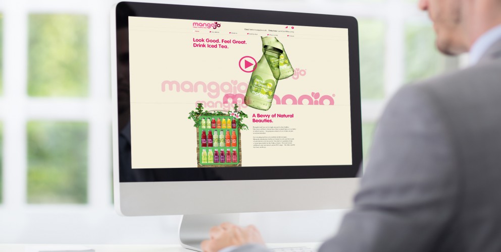
We’ve worked with this super fun and funky global brand for 3 years. In that time, we’ve worked on a number of projects, and most recently – was asked to redesign and redevelop their website.

MangaJo sell Healthy drinks in over a 20 countries, so the new website had to appeal to an ever growing user base. They wanted an uber cool, fun, and funky website that was informative, easy to use, and update.

We created a feel good website that looks and feels as fresh and funky as the MangaJo brand. We kept it minimal, utilising great product photography, cool illustrations and most of all made it fun. The site was built with a system that enabled the client to update any page, quickly and easily.

Needless to say, we were chuffed to bits with great feedback received so far, and the fantastic responses from the many visitors on the website.

27/08/2012

The Reward Practice website

The Reward Practice are an independent source of advice on how to reward, incentivise and motivate staff. As part of our branding development for the Reward Practice we were asked to do a complete redesign and development of their existing website.

We started from scratch with this project. The existing site just wasn't doing it's job and the new site had to contain considerably more information. The task for us was how to keep the clean minimalist look and feel of the new branding we had created whilst containing such a large amount of resource material.

Good use of grids and structured typography normally does the trick in these situations and it was perfect for this project. What initially looks like a lot of text, doesn’t look and feel as heavy and crowded. Also, the site could be used for information on the specialist subject of rewards and incentives. This has naturally attracted a more traffic to the site.

Overall, the new site has helped The Reward Practice reach out to a much larger audience and has helped them sell their product more effectively.

16/07/2012

Global Filmmakers pitch win

We've just been told we have won the three way creative pitch we took part in at the beginning of the month. The pitch was for the branding and website design and development of Global Filmmakers. One of the most comprehensive, efficient and most advanced video production packages available in the UK.

We cant wait to get started. Action!

22/05/2012

Manchester Digital Skills summit identity

The Manchester Digital Skills summit is a source of valuable information and guidance for anyone who needs access to digital talent and it’s the opportunity for the digital community to shape skills development across the region and keep the next generation of digital talent in Manchester.

We were asked to create a logo for the event and happily obliged with this cool typographic marque which includes the Manchester Digital logo.

This is a great event and we thoroughly recommend if your into digital, and live in the North West, you get yourself to the event.

Hopefully see you there.

13/05/2012

The Reward Practice brand identity

We are proud to announce the official launch of The The Reward Practice brand identity.

The Reward Practice are a totally independent source of advice on how to reward, incentivise and motivate staff as efficiently as possible. They asked us to make their brand appeal to their customer base (FTSE 100 organisations), feel professional, corporate and stand out from their competitors.

With a substantial proportion company revenues being spent on paying and motivating employees, organisations need to ensure that every single payroll Dollar, Euro or Pound is wisely spent.

The experience of our friends at The Reward Practice shows that it is entirely possible to reduce overall payroll spend and improve the pay and incentives available to high performers in mission-critical jobs.

The saying ‘Earning the Fruits of your labour’ inspired the branding concept. The feel we got from this was Rewarding, Hard work and Organic. With these words in mind we created eye-catching graphics – inspired by fruit, contemporary typography and a brand that looked confident, corporate but fresh and different enough to stand out of the crowd.

23/04/2012

Online estate agency advertising campaign

Here is the first glimpse of the new advertising campaign we have created for online estate agency Self-sale.com. The look and feel of the campaign uses the graphic illustrations we created back in February as part of the brand refresh.

This is the first bill board advert to be designed and we are over the moon with the positive feedback we have received so far.

17/04/2012

Nomadic Properties website

We are chuffed to bits to announce the launch of the Nomadic Properties website.

They asked us to create a website that was not only modern, easy to use and easy to update, but would also showcase the great work they’ve been doing, from stylish country retreats to elegant period conversions.

We created a simple but sophisticated website that was easy to use and easy to update, we also decided to let their beautiful work do most of the talking, showcasing their images to the best of their abilities.

We looked at how they put style, craftsmanship, technical ability and planning into their buildings and used it as inspiration for their website.

This resulted in, easy to use but highly structured layout grids, stylish graphic silhouettes and well-thought-out site plans.

Finally, the site was built with a system that enabled the client to update any page of their website, anytime at their leisure.

04/04/2012

Manchester Digital roster badge

Manchester Digital recently asked 22 to design a badge for their roster.

The Roster acts as a recommended supplier list for customers looking for trusted suppliers from a wide range of disciplines including creative, marketing and media, through to technical, software and ICT.

Successful applicants will be awarded a Roster Badge which can be carried on their website and stationary as a way of telling potential customers that they are a quality supplier in a named discipline.

In keeping with the Manchester Digital brand identity we created a minimalist badge that uses digital source code as the theme.

26/03/2012

The Bond Board annual report

The Bond Board are a charity who help in preventing homelessness by assisting people to secure and maintain homes in the private rented sector.

We have recently designed and produced their annual report and it has just come back from the printers. We can't keep our hands of it! If you don't already know, to say we are partial to a nice bit of print would be an understatement.

We have really gone to town on this one!

The report comes in two halves. The A2 wrap around cover contains all the facts and figures and is printed 2 colour on A2 sheets of brown paper.

The A4 12 page brochure contains case studies of people who have been helped by the Bond Board over the last year. Photography is by the wonderful James Maddox

We used this interesting format so that the brochure could be sent out as a stand alone promotional item without the figures and be used as a promotional brochure.

28/02/2012

Self-sale.com brand refresh

We have been working with Self-sale.com for over 4 years. They are one of the North Wests first and most successful online estate agents. By putting their resources into marketing property online they save money not having to pay for expensive shop fronts. They pass this saving onto home sellers and offer incredibly low rates. Cut a long story short they save home sellers thousands in agency fees. There are definitely onto a good thing!

We created the Self-sale.com brand identity in 2008. It has served them well but needed a bit of spring clean. We feel keeping a brand looking fresh once it has been launched is a really important way to keep customer interest.

With this in mind we have commissioned new photography, and some eye catching and graphic illustrations that will be perfect for the advertising and marketing campaign that will be rolled out over the next few months.

27/01/2012

Miss Out…No chance — Smoke Free campaign

22 have created marketing material for the The 'MISS OUT... NO CHANCE' anti smoking campaign.

Smokers die young. A quarter die in middle age and many even younger. The campaign is targeted towards parents with the powerful message 'Don’t miss out on your family’s future'.

The campaign is part of the Department of Health launched National Smoke Free campaign.

29/12/2011

NHS Tameside and Glossop Annual report

22 have recently finished the design and production of the latest Public Health Report for Tameside and Glossop.

This years Public Health Annual Report focuses on 5 health priorities which were the health issues for the local population:

  • Tackling health inequalities and life expectancy
  • Deducing premature death from cardiovascular disease (which includes conditions such as heart attacks and strokes)
  • Reducing harm from alcohol
  • Improving mental health and well-being and a healthy start in life

We came up with the title and theme for the document "Give me 5' The number theme is used as a devise throughout the 48 page document.

The report has been designed to be readable for an informed lay reader as well as professionals who are interested in the health of people in Tameside and contains some fantastic reportage photography of local care workers and patients.

Manchester

+44 (0) 161 672 7822
enquiries@22group.co.uk

26 Dale Street, Manchester, M1 1FY
Find us on Google Maps

Our partners

22 Group is the umbrella company for creative work.

Check out our specialised branches for work in the property and finance sectors: Property Stream | Finance Stream

22 Group is a proud member of The Pride, an alliance of independent creative and communications companies.

Copyright © 22 Group Ltd. 2020. All rights reserved.