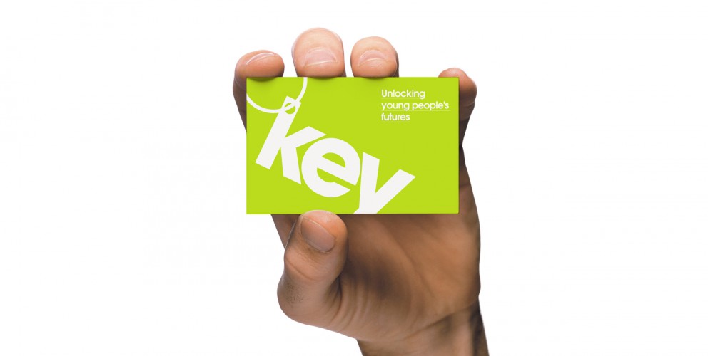
We are chuffed to bits to announce the launch of the Key youth charity branding and website! Thanks to the team for all of their hard work and thanks to Key for being such a cool client.
We were asked to reinvigorate and refresh the look and feel for the youth charity Key. Their tired brand identity and website didn’t fully represent them as a charity aimed at young people.
Key is an amazing charity that provides housing support to young people up to the age of 25. Offering a variety of services including mediation, support, mentoring and counselling, it was imperative that their target audience could instantly connect with the brand; moreover to actively encourage them to get in touch and not immediately dismiss Key because of their outdated design.
Director of Key, Ursula Patten had a clear vision for the brand: “Key decided to update its identity as although our black and white Key was well designed and had been used for a long time, a number of young people had commented that it was boring and austere."
“We were looking for something to reflect that we are young person focused. We wanted something more colourful and more vibrant. We were delighted with the new logo - it was bright and simple - we felt that it wouldn’t date. This was the starting point for the redesign of the website. The old website was very static and one dimensional and again didn’t reflect Key’s ethos.”
Through clever use of typography we created a modern and engaging logo with subtle reference to the shape of a ‘Key’. The bright colour pallette, angular typography and photos of service users created a distinctive and memorable look that genuinely conveys Key’s message.
Key’s core requirements for the site were to appeal and convey vital information to young people who need help, and to also shout about the great work it is doing in order to fundraise and attract volunteers. These were also fulfilled by developing two clear routes through the site by using compelling graphic design.
Patten and the board of trustees were delighted with the end result and our collaborative approach: “We chose 22 as a number of our trustees had seen previous examples of their work. We were impressed by their professionalism. It helped that the staff put in the time to work with the board of trustees and took them through a number of design options and the thoughts behind them."
“The website design element felt like a two way process with Key’s thoughts and ideas fully incorporated. It is no easy task to build a website that will please all those involved, but 22 have been patient in ensuring that this happens. We are extremely pleased with the result. It doesn’t just look like any other website. It is bright and engaging.”
It was great to work with a charity that gives so much back to the youth community of today, it made this project so much more meaningful. It’s a privilege that our designs and strategic positioning of the brand will help young people to get the assistance that they need.
