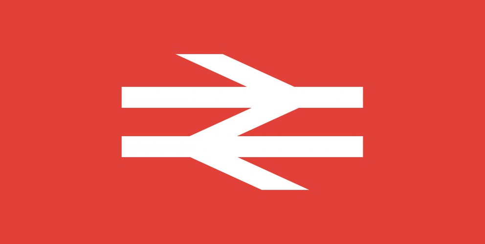
Over the next few months we are going to be listing our top 10 favourite logos of all time.
We are starting with an absolute corker, the one and only British Rail logo. OK, this maybe not be the sexiest marque you have ever seen but it has the stats of an absolute Top Trump.
When it comes to longevity it gives Cliff Richard a run for his money. It just keeps on going and going...in fact the logo, first commissioned in 1965, is still being used in 2013! Long after the demise of British Rail the marque is now used on traffic signs throughout the United Kingdom.
"In 1964 the Design Research Unit—Britain's first multi-disciplinary design agency founded in 1943 by Misha Black, Milner Gray and Herbert Read—was commissioned to breathe new life into the nation's neglected railway industry, the corporate image of which had remained largely unchanged after its nationalisation in 1948, a reflection of a largely disjointed and out-of-date transport system. The company name was shortened to British Rail and Gerry Barney of the Design Rearch Unit conceived the famous 'double-arrow which represents two tracks, heading in different directions, and crossed by stylised points." - Nick Jobs
There certainly aren't many logos out there that have lasted longer than the company they were originally created for! Here are some great articles about the history and application of this branding gemstone.
http://www.guardian.co.uk/artanddesign/artblog/2006/dec/12/everydesignthebritishrail
