01/10/2021

What is a landing page?

Have you been hearing “Landing pages are great” or “You should be using landing pages”? If you’re not in the digital industry, it's probably a foreign term to you. 

So, what is a landing page? 

A landing page is a standalone web page that a consumer can land on by clicking a link. It is designed to convert visitors into leads. 

It’s common for a landing page to have no navigation bar, it ensures the visitor is not distracted and led elsewhere. Along with no navigation bar, there is typically a form to capture the visitor’s information. 

person at a laptop about to fill in their credit card details online.

How do landing pages work?

  1. A user sees a call to action, clicks it and ends up on a landing page with a form.
  2. The user fills out the form and becomes a lead. 
  3. You receive the information the user filled out and have it in your database.
  4. You can now market to the lead. 

Once they have filled out the form, they should be redirected to a ‘thank you’ page. 

What should be on a landing page? 

Start with a compelling heading to keep your visitor on the page and then a brief description of what is being offered. 

The content on the landing page should be concise and encourage the visitor to fill in their information - identify their problems and mention how you can solve them while benefitting them. 

As well as the informative content, you may opt to have trust building elements like testimonials or professional industry logos. 

It’s important to keep the consistency of the content so that it matches the visitor’s previous source. If the message is not the same, it can confuse the visitor and they’ll most likely hit the back button thinking they’re in the wrong place.
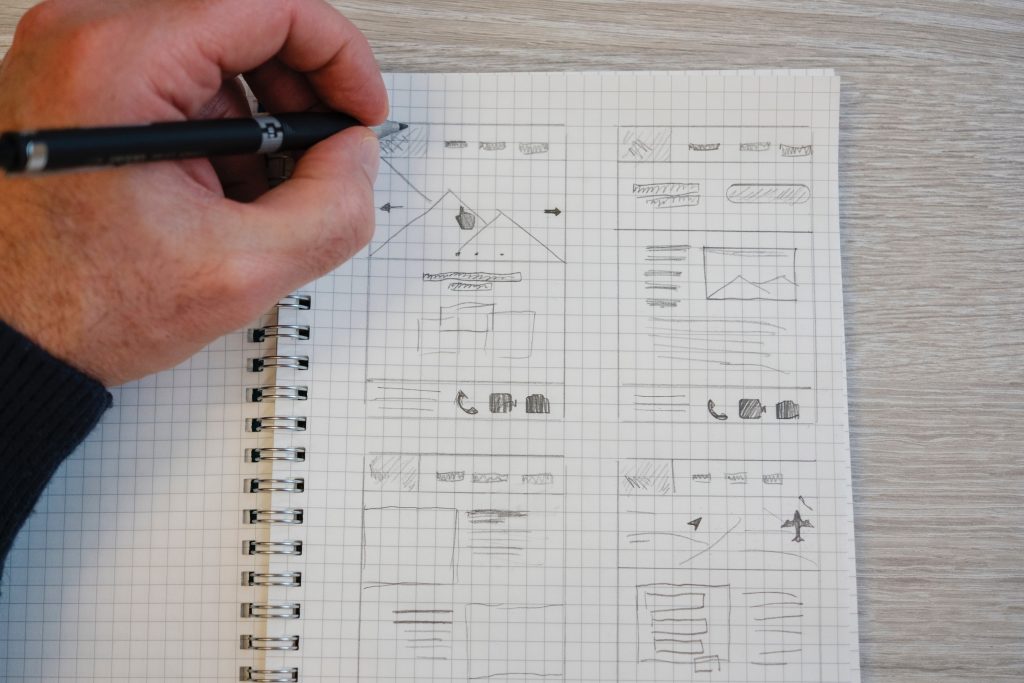
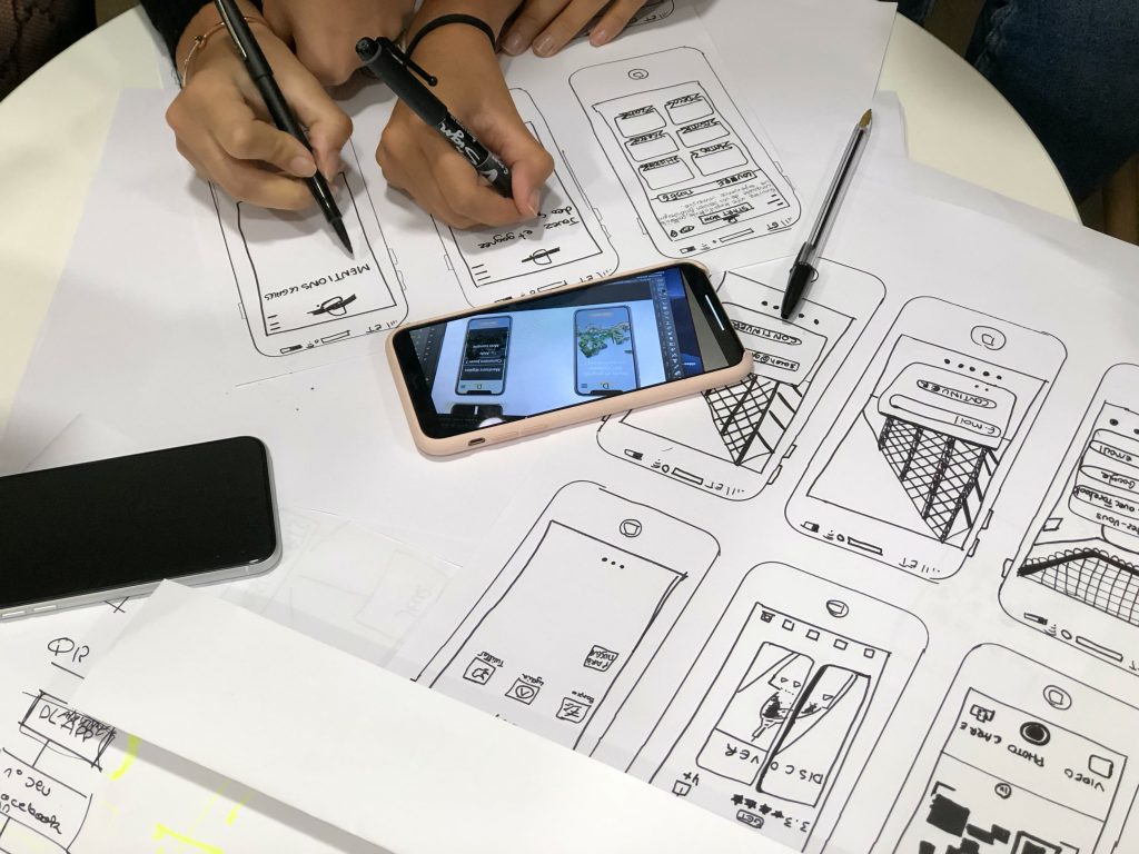
pencil drawing of a landing page plan

Why use a landing page? 

Now you know what a landing page is, these are the reasons why you should use them: 

  • Drive traffic

By having concise, straightforward information you’re enticing visitors to your landing page and encouraging conversions. 

  • Improve SEO

When creating a landing page, using targeted keywords and SEO best practices will help drive organic traffic to your website. 

  • Great as a PPC strategy

The dedicated content will target what your potential customer is looking for and quickly meet their needs, leading to a conversion. 

  • Target your audience

By having content for a specific audience, that touches on their pain points and offers a solution unique to them, they will first find your content more interesting and secondly, they’ll be able to relate more.

  • Generate leads and conversions

Landing pages help to generate qualified leads. You can bet the person who has just clicked through to your landing page and filled in your form is legitimately interested and ready to have a chat. 

  • Direct and to the point

Landing pages are designed to be free from distractions with no navigation bar and a focused message, this increases the chances of conversions. 

Are you interested in landing pages for your business?

At 22Group, we are a team of talented web developers, branding experts and marketing pros. We can help you create a landing page, design it in line with your branding and write captivating copy. 

We’d be happy to help answer any questions or discuss further - get in touch

25/02/2021

Benefits of blogging

Do you have a specific section on your website for blogs or articles? There’s definitely a need for them and it brings so many benefits - it’s a no brainer. No matter what industry you are in, it’s a must. 

Blogs should be kept up to date and informative. It’s a section of your website to show your knowledge, be informal and share topical, relevant and useful information. Whether it’s about your company or a specific industry topic, it’s a diverse space for educating your customers.

Having a blog isn’t enough, to reap the benefits there should be consistent posting and you should be regularly sharing content.

What benefits does having regular content bring to my company? 

  • Establish your brand

Blogs enable you to build up and create brand awareness. Writing about who you are, what your company does, what you stand for and who your company provides a service or product to really lets readers in. They are able to learn if they are the right customer and what it would be like to be yours.

  • Improved SEO

A major advantage of blogs is that they will help improve your SEO, your search engine ranking. Google is constantly updating and changing how it ranks websites and relevant and regularly updated content is a key measure.

This minefield of a task is definitely best for an SEO expert - something we have covered here at 22 Group. Keep in mind that just writing lots of blogs doesn’t instantly improve your SEO, there’s a lot more to it like researching and using keywords.

  • Content for social media

Your blogs are longer forms of writing which you wouldn’t post on social media. The discussion, in-depth views and more serious tone isn’t what social media is about. It’d be too long and the audience would most likely lose interest.

On the plus side, sharing links to your blog post via social media is a great addition to your on-going social media programme. It can be shared on your channels to generate shares and involvement from your audience or potential customers and helps to drive users to your website.

  • Engagement 

Everyone has an opinion and none of us thinks the same. When something happens or is going to happen, people seek what others think so this is great for you to portray your company’s voice and allow those in your industry or community to engage.

  • Organic leads

Having regular content really does make a difference. Leads that come to you through your blogs are bound to be suitable since they have read and got a feel of what your business is like. 

  • Educate your customers

Teach your customers and potential customers about what you offer, what you can do or if there are any major updates on what you provide. 

Customers like to be informed before committing, with so much competition out there this is your opportunity to show them what sets you apart. The more they understand, the more likely they will become the right customer or client for your business. It’s about building trust.

22 group employee typing away on their laptop, writing a blog post for a client

So how often should we post a blog? 

There isn’t one answer, this definitely depends on a few factors such as what’s best for your company, how big the company is, the resources you have and what your overall goal is from doing these blogs. 

This is something 22 Group can help discuss and plan accordingly. Our copywriters are skilled at making sure content is bespoke to you, using your tone of voice and brand values.

Interested in a chat or to see what we can deliver? Get in touch with us

02/12/2020

22 days of Christmas

Welcome to our digital A-Z jargon-buster as we count down the days to Christmas. 22 is our take on 25 in our Advent Calendar 2020.

Check in every day on our website or across our social media to learn a new word or refresh your vocabulary for websites, branding and marketing - in alphabetical order.

‘Tis the season to share, learn and be merry and we would love you get involved in our Advent Calendar so please share, like and comment!

If your business needs help in unravelling the constantly changing digital world, let us know. Our expert team can help to future-proof your online presence and make a splash through awesome websites, branding and marketing campaign.

We hope you enjoy following our #22daysofchristmas countdown.  

Let's start at the very beginning, a very good place to start.

A is for Algorithm: Complex programs used by search engines (e.g. Google) to find, rank and return the most relevant pages for search queries.

B is for Breadcrumb: A text path featured at the top of a web page showing where you are on a site. Thanks to Hansel & Gretel for helping us back home.

C is for Canonical tag: Way of telling search engines that a specific URL (Uniform Resource Locator) represents the master copy of a page. Prevents problems caused by duplicate content appearing on multiple URL’s.

D is for Domain: Name used to identify a website’s unique online space e.g. 22group.co.uk Domains are purchased and registered.

E is for Email marketing: Don’t just email your clients – capture, nurture, convert, retain. Do it right and it can be very powerful.

F is for Favicon: A tiny custom icon displayed to the left of your web address in your browser to help give brand or service identity. We have 22 in a circle. What’s yours?

G is for Goal: A measure of  how well your web site fulfils your target objective and represents a completed activity, called a conversion. Do you have your goals set up in Google Analytics?

H is for HTML: Hyper Text Mark-up Language, widely known as the language of the web. HTML are tags or commands informing the web-browser how to present a webpage.

 I is for Infographic: A graphical representation of data or information. A great way of creating and sharing interesting content in marketing campaigns and on social media.

J is for JavaScript: Scripting language used to create and control dynamic website content - anything that moves, changes or refreshes on your screen.

 K is for Keywords: Specific words or phrases which describe your content. It’s what your customers or potential customers would enter into a search engine.

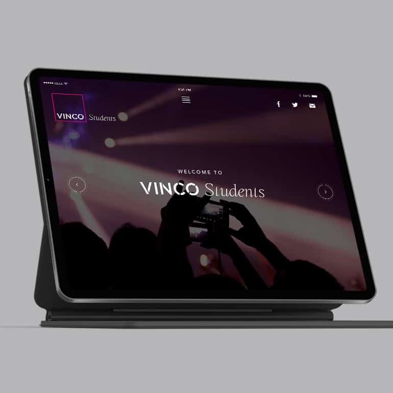
L is for Landing Page: A specific website page which will show up when a particular link is clicked. Just like the one in our caption!

M is for Meta Description: The small amount of text which is seen on search engines before a site is clicked on. It gives a summary of the web page content.

N is for Newsfeed: Where updates from people or brands you follow are shown. Typically on social media, it will show profile changes, new photos uploaded, etc. 

O is for Organic Marketing: When your customers are coming to you naturally without using any paid advertisements to attract them.

P is for Plug-in: An add-on software which brings new functionality to a program or website. It allows customisation, enhancing its capabilities.

Q is for QR Code: A quick response (QR) code is a type of barcode that can be read by a smartphone. Once read, this leads you to a specific website or content page.

R is for Responsive Layout: This is when a website is able to adjust its screen size depending on the digital device that is accessing it.

S is for SEO: Search engine optimisation is the technique of improving your website and its content so that it appears higher in search engine rankings.

T is for Traffic: In relation to a website this refers to the amount of visitors, also known as “sessions”. This is a great way to measure online success. 

U is for UX: User experience (UX) refers to the overall experience of the user’s interaction with a product, system or service.

V if for vlog: Instead of a traditional written blog, a vlog is a video blog. Involving filming experiences, thoughts and opinions to share with a wider audience.

W is for Wireframes: Like a blueprint, a wireframe shows the plan for a web page. It is typically not coloured and more to see the layout, features and spacing.

X is for X-Post: Short for cross-post this refers to posting content on multiple platforms, expanding the audience reach.

Y is for Yak Shaving: In programming this is the need to complete a task, to be able to proceed with the next. Like pulling your Christmas cracker before eating.

Z is for Zip File: A computer file that is compressed. By reducing the size it means it takes up less space and is easier to transport.


03/07/2020

UX (user experience) design

UX design is a term that you might begin to hear if you’re in the process of getting a new website.

But what does it mean? Really? 

If you’re new to the web design and development process, it can be disorientating hearing lots of tech jargon.

As designers and developers, we can sometimes be guilty of ‘tech talk.' But we also really determined to explain things clearly and simply to our clients.

After all, Albert Einstein said it best: ‘If you can't explain it simply, you don't understand it well enough!'

What exactly is UX design?

So we’re going to explore UX design here. And for starters, let’s unpack the acronym.

UX design stands for ‘user experience design.’ It’s a small term that covers a lot of ground.

UX design is the web design discipline of designing with the user in mind. UX design involves always thinking about user interaction and usability of a site.

A significant part of UX design is the research phase. This involves a study of your audience, your customers.

A UX designer will want to know as much as possible about the users of your site. How old do they tend to be? Are they working professionals? Do they engage well with your current site?

What does UX design achieve?

UX design is something we have all experienced - without even knowing it.

Everyone knows the feeling of being on a website where everything just sort of clicks. Information is easy to find. You can navigate around the site smoothly. You find what you were looking for straight away.

Of course, everyone has also experienced the opposite of UX design. A slow loading site with lots of pop-ups and a crowded layout that gives you a headache.

We’ve all been in the situation where we’ve clicked away from a bad site within the first few seconds!

These are the kinds of sites that didn’t prioritise UX design. And they tend to have a high bounce rate and poor user satisfaction levels.

This can have a huge impact on your google rankings - so it’s not something to brush off or take lightly.

What do UX designers do?

UX design, or user experience design, covers a broad range of practices. It tends to include user research, wireframes, visual designs and prototypes.

UX designers create concepts based around user journeys and flow - meaning how the user travels from one part of the site to the other.

Wireframes are like the skeleton of a website. They show the architecture of a site before colour, graphic and designs are added. This helps designers see how the site will function, and how the user will interact with it.

A UX designer's job is to see the online experience through the eyes of the user. They will identify any possible pain points. They can spot which pathway through the site feels clunky and can register which call to action engages them.

So where is UX design heading?

It seems like the future of UX design is heading towards more simple designs. Users tend to react the most favourably to easy-to-use sites with simple functions.

Amazon’s one swipe buying process, for example, is UX design at its most simple and accessible.

We are expecting our tech to do more and more, and make our lives increasingly easier. UX design will have to do more for us, whilst seeming as simple and effortless as possible. No mean feat!


If you’re in the process of building a site and would like some advice on UX design, we’d be happy to chat. Or, if you already have a site but this your UX design needs improvements, don’t be afraid to pick up the phone and ask for a bit of advice.

10/11/2018

More than just a trend – Charities need to be more active on Twitter

You are probably aware of the popular online social networking website, Twitter. Founded in 2006, it now has over 310 million active users every month. You are quite possibly one of those active users yourself but are you using Twitter enough to promote your charity?

The word ‘twitter’ itself can be defined as ‘a series of short, high-pitched sounds’. That is exactly what Twitter should be used for. Spreading awareness through a series of short, high-impact messages that can be heard by your audience - Not just a quiet blur in the background that occurs once per week or month.

What is great about Twitter, is the ability to connect with an audience through a shared interest, an audience who want to speak about the same things and care about the same causes, an audience who are only 140 characters away...

Charities have found a new way to get their message heard by the right people. It doesn’t require an expensive TV campaign or 50,000 printed leaflets being handed out, only to be tossed in the nearest recycle bin. It requires a strong message and a hashtag.

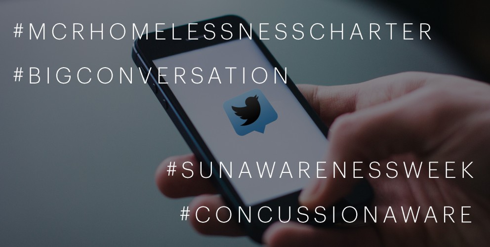
As a marketer, I naturally check the trending column of Twitter each day (this shows what everybody online is tweeting about). Today 5 of the 10 viral hashtags belonged to charities. There were 3,511 Tweets about the #BigConversation for Dying Matters Awareness Week and 1,218 Tweeting under the hashtag #CoeliacAwarenessWeek. The others were #MCRHomelessnessCharter, which aims to tackle homelessness in Manchester, #ConcussionAware and #SunAwarenessWeek.

Whilst giving an insight into the level of competition in the charity sector, the amount of engagement the hashtags have received also show a trend in themselves... People online are willing to talk about a cause, they want to hear your message and in response they want to share their experiences and feelings. This not only strengthens brand awareness for yourself, it creates that short, high impact message that reaches the right people. Those who spread awareness and those who donate.

Whilst giving an insight into the level of competition in the charity sector, the amount of engagement the hashtags have received also show a trend in themselves... People online are willing to talk about a cause, they want to hear your message and in response they want to share their experiences and feelings. This not only strengthens brand awareness for yourself, it creates that short, high impact message that reaches the right people. Those who spread awareness and those who donate.

View some of our charity projects here.

If you need help making some noise on Twitter. Email hello@22group.co.uk or call 0161 672 7822 and we will help you put together a social strategy to really get you recognised.

18/04/2016

Northern Business Expo- Creative

OFFER EXTENDED: Sign up to either of our creative packages before the end of April and get a FREE 2 sided flyer designed and setup for print worth £225

Creative package/

£800 (Usually £1,600)

Realise the power that branding can have on your business with this 'feel the brand force' starter pack.

Package includes:

— 1 hour brand identity development review

— Research and analysis of your competitors and market leaders branding

— 3 bespoke logo concepts with 1 set of amends on your chosen route, supplied in various file formats for on and offline use

— Stationary designs and print ready artwork including; business cards, comp slip and letterhead

— Social media graphics

— Logo usage print / web guidelines


All packages are subject to terms and conditions

Sales brochure/

£322 (Usually £450)

A well designed sales or corporate brochure is essential for conveying your products, values and services, in a professional and appealing way to your potential or existing clients.

Package includes:

— Evaluation of your current literature

— Design of a sale brochure (up to 16 pages) in a print ready format

— Up to 4 stock photography images

— Up to 8 bespoke icons

— Up to 4 bespoke illustrations / graphics

Extras

Additional pages: £75 x 4 pages

Content writing costs: £700 up to 10 pages


All packages are subject to terms and conditions

email us at hello@22group.co.uk -  Offer only available until the end of April 

13/04/2016

Come see us at the Northern Business Expo – We’ll make it snappy!

The team at 22 Group are exhibiting at the Northern Business Expo on 14th and 15th April. The renowned business exhibition, which is free to the general public, provides business owners with the opportunity to forge valuable relationships with potential customers and suppliers, gain solid business advice from over 150 exhibitors as well as the chance to take part in free seminars and skills packed workshops. Two of those will feature 22 Group members this year in the Digital Marketing hub. The Expo has always attracted leading speakers and thought-leaders, this year featuring supermodel Caprice talking about how she built up her global enterprise.

Our award-winning Creative Director, Robin Arnold is holding an ‘Introduction to Branding’ workshop at 10.30 each day, which explores how understanding the difference between branding, marketing, design and advertising can lead to business success. If online is more your forte, at 2.15 you can head over to hear from Marketing Manager, Amber Stevens at a fun social media workshop which will provide you with the basic skills and knowledge to get started online and advice on how to make your social media campaigns an ongoing success.

If you fancy a break from developing new skills and knowledge, pop over to stand A22 to meet the rest of the team and get your selfie snapped for a chance to win a luxury 2-night stay in the prestigious Mayfair hotel, 9 Hertford St, just moments away from Buckingham Palace.

You can register here for your free tickets http://www.northernbusinessexpo.com/tickets/

See you there!

23/04/2012

Online estate agency advertising campaign

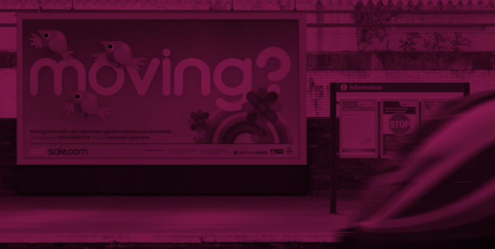
Here is the first glimpse of the new advertising campaign we have created for online estate agency Self-sale.com. The look and feel of the campaign uses the graphic illustrations we created back in February as part of the brand refresh.

This is the first bill board advert to be designed and we are over the moon with the positive feedback we have received so far.

04/04/2012

Manchester Digital roster badge

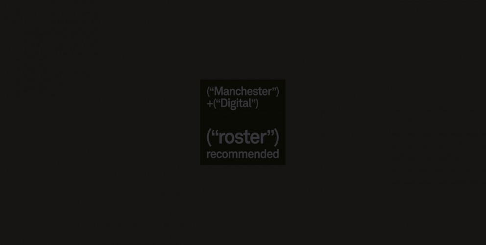
Manchester Digital recently asked 22 to design a badge for their roster.

The Roster acts as a recommended supplier list for customers looking for trusted suppliers from a wide range of disciplines including creative, marketing and media, through to technical, software and ICT.

Successful applicants will be awarded a Roster Badge which can be carried on their website and stationary as a way of telling potential customers that they are a quality supplier in a named discipline.

In keeping with the Manchester Digital brand identity we created a minimalist badge that uses digital source code as the theme.

26/03/2012

The Bond Board annual report

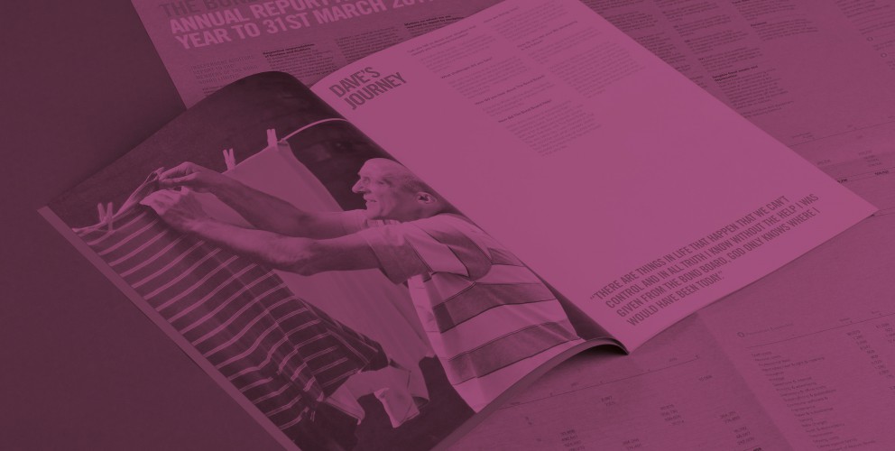
The Bond Board are a charity who help in preventing homelessness by assisting people to secure and maintain homes in the private rented sector.

We have recently designed and produced their annual report and it has just come back from the printers. We can't keep our hands of it! If you don't already know, to say we are partial to a nice bit of print would be an understatement.

We have really gone to town on this one!

The report comes in two halves. The A2 wrap around cover contains all the facts and figures and is printed 2 colour on A2 sheets of brown paper.

The A4 12 page brochure contains case studies of people who have been helped by the Bond Board over the last year. Photography is by the wonderful James Maddox

We used this interesting format so that the brochure could be sent out as a stand alone promotional item without the figures and be used as a promotional brochure.

27/01/2012

Miss Out…No chance — Smoke Free campaign

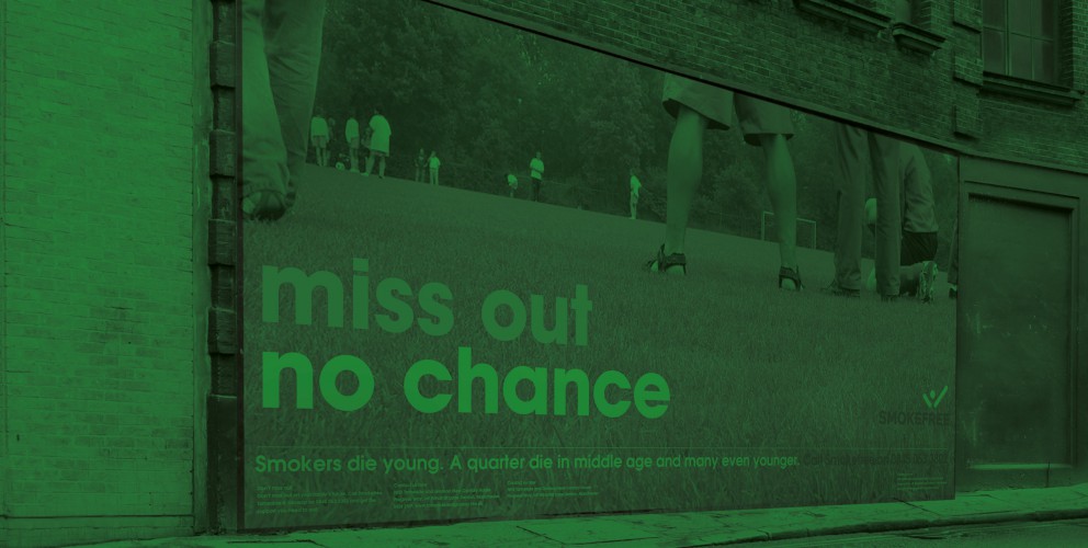
22 have created marketing material for the The 'MISS OUT... NO CHANCE' anti smoking campaign.

Smokers die young. A quarter die in middle age and many even younger. The campaign is targeted towards parents with the powerful message 'Don’t miss out on your family’s future'.

The campaign is part of the Department of Health launched National Smoke Free campaign.

Manchester

+44 (0) 161 672 7822
enquiries@22group.co.uk

26 Dale Street, Manchester, M1 1FY
Find us on Google Maps

Our partners

22 Group is the umbrella company for creative work.

Check out our specialised branches for work in the property and finance sectors: Property Stream | Finance Stream

22 Group is a proud member of The Pride, an alliance of independent creative and communications companies.

Copyright © 22 Group Ltd. 2020. All rights reserved.