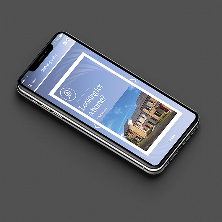
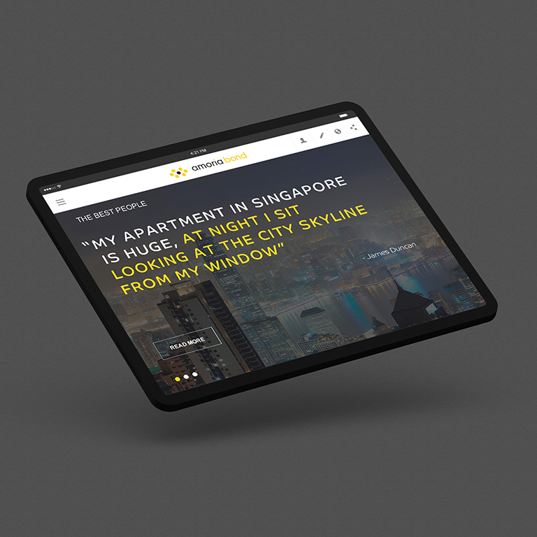
Your homepage serves as the introduction to your site and, ultimately, to your brand.
It’s also a sort of contents page which should effectively signpost users around your site clearly.

As well as looking great and making a good first impression, your homepage should also prioritise converting leads.
Take a look at how to get the most out of your homepage...
Make sure you clearly tell the world who you are, and what you do
Unless you’re a globally renowned brand, a good website homepage should effectively communicate who you are and what you do, to encourage your audience to stay on your site and find out more.
It’s thought that you need to engage users within the first 16 seconds. And you know what they say, you never get a second chance at a first impression.
If you are unsure about your key message and what your brand is trying to say, spend some time refining this first.
Include great design and strong images
The best content and copy in the world can get overlooked if your design and use of images doesn’t engage people.

A well-crafted homepage will combine graphics, text and multimedia in a creative way, to ensure the main purpose of the page is communicated effectively - but looks visually appealing.
It is worth noting that images of your team are really important to include, and your own personal photography will tend to be more engaging than generic stock images.
