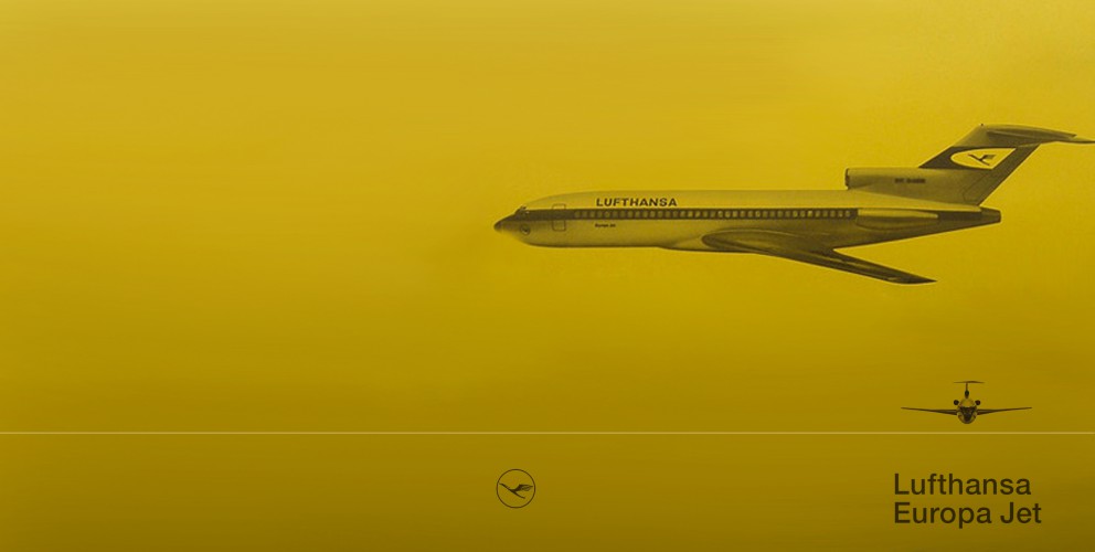
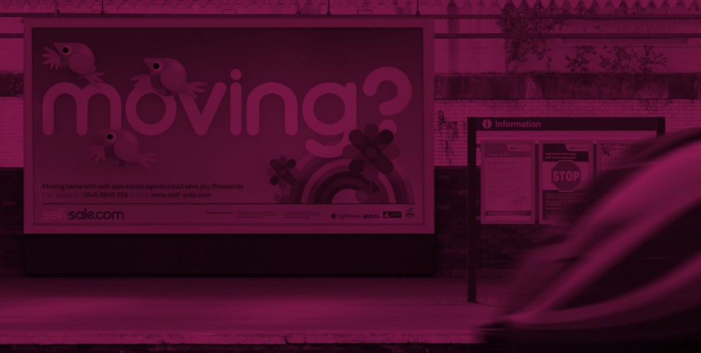
As some of you may or may not already know we have a bit of penchant for retro design. The standard of typography, and photography on some of our favourite 60's / 70's poster designs is in a class of its own. Their purest simplicity makes them timeless masterpieces that look contemporary 40 years after they were crafted.
Whether or not you are fan of Swiss typography and well structured grids, you can't deny this is why the posters look so fresh and modern in 2012.
Some of our favourites include Ivan Chermayeff’s beautiful but uncompromising, Modernist Pan Am Airlines adverts. Here is a great article about the story behind them. http://bit.ly/Tyk5tt
And the incredible design legacy left behind by Otl Aicher's identity system, iconic posters and highly influential imagery for the 1972 Munich Olympics. http://bit.ly/U8fr6w http://bit.ly/Tyk5tt
I only wish the legacy had reached a little further and touched the orchestrators of the London 2012 Olympic identity. But don't get me started me started on that! That's another story... if only Otl had been on the case in 2012!
And last but certainly not least, the master of all grids, Josef Müller-Brockmann http://bit.ly/V6v4ML
He is perhaps the most well-known Swiss designer and his name is probably the most easily recognized when talking about the period. His incredible obsession with grid systems goes to the point where he includes in his book aptly named the 'Grid System' a grid layout for arranging furniture within a room. http://bit.ly/Tyq4OU
Mr Muller, we will definitely keep this grid in mind for the new 22HQ layout!


