Zedra Global
Giving financial services a new lease of life.
Deliverables
Colour palette
3D animation
Iconography
Photography
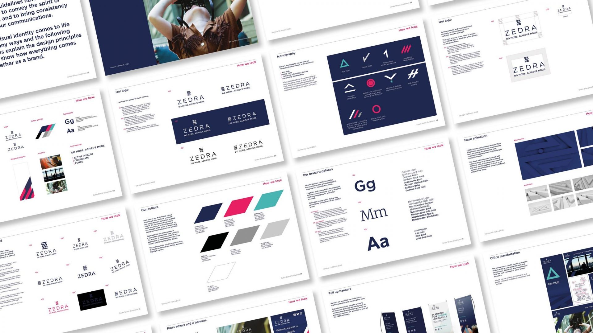
Background
Zedra is a successful financial institution, specialising in Trust, Corporate and Fund services. In this highly fragmented industry, Zedra has become a robust player by offering multifaceted services.
The time had come to give the brand a refresh. The core Zedra visual identity was strong. The logo, in particular, did not require changing, but the brand needed re-energising and refreshing to tie in with the exciting new service offering.
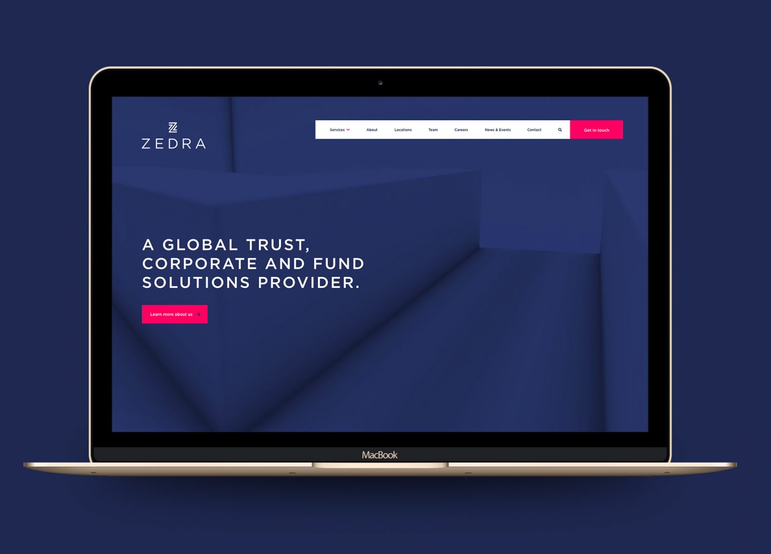
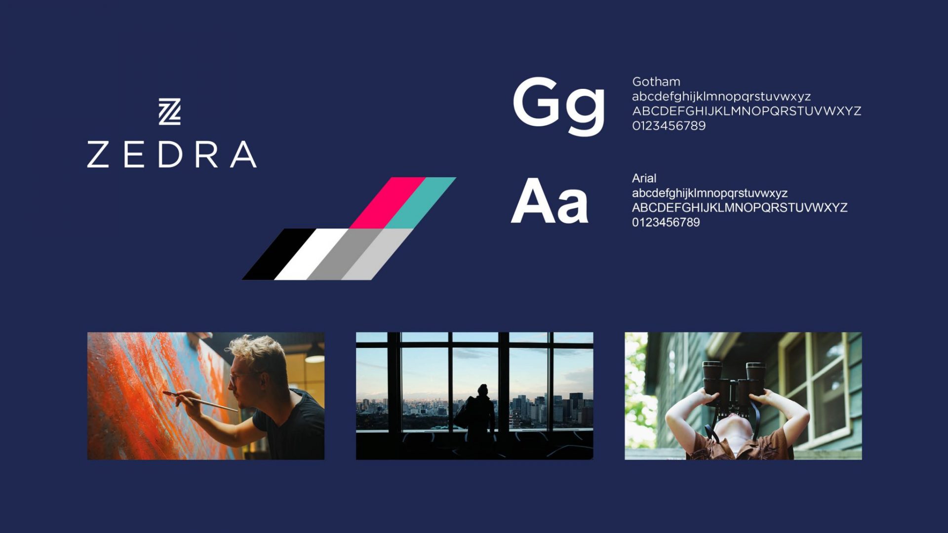
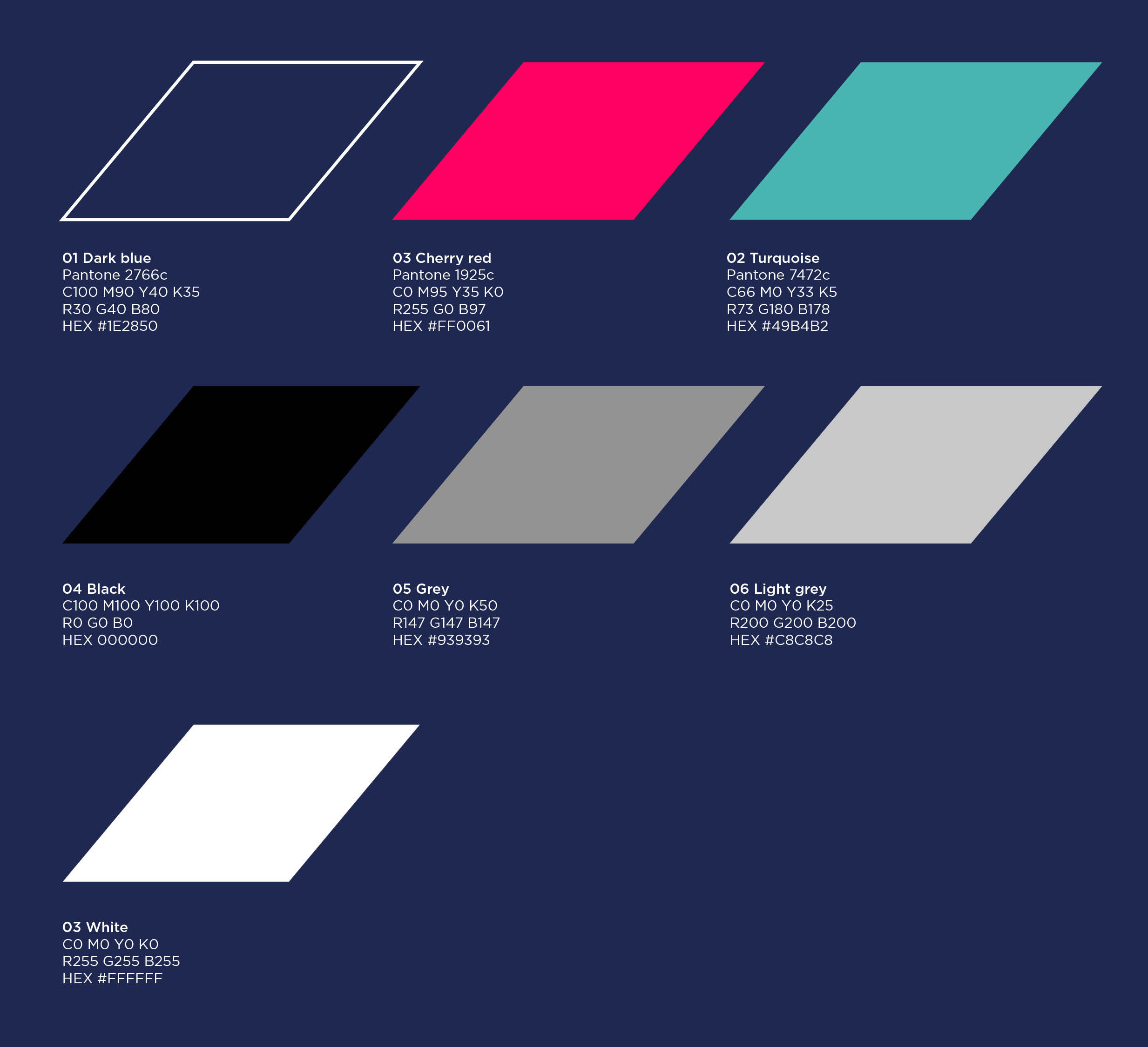
A bright colour palette
We updated Zedra’s colour palette so they appeared stronger online. We went for a more dynamic, bright and contemporary look. This really helped to make them stand out from their competitors.
While keeping Zedra’s signature blue to ensure they remained instantly recognisable, we updated their ‘cherry red’ to ensure that it caught people’s eye instantly. As well as the colour palette, we updated a whole host of other assets for them:
- A modern maze of complex regulations
- Iconography to represent their values
- Photography which conveys their services
- Strong visual graphics
'In a modern maze of complex regulations and requirements, our clients are presented with unexpected opportunities and challenges in equal measure.'
A modern maze of complex regulations
We created a unique maze animation to represent Zedra's concept of a 'modern maze of complex regulations.'
The animation is presented on the homepage and shows a ball running through a maze shaped like the Zedra logo, symbolising how Zedra will guide you through a tricky process.
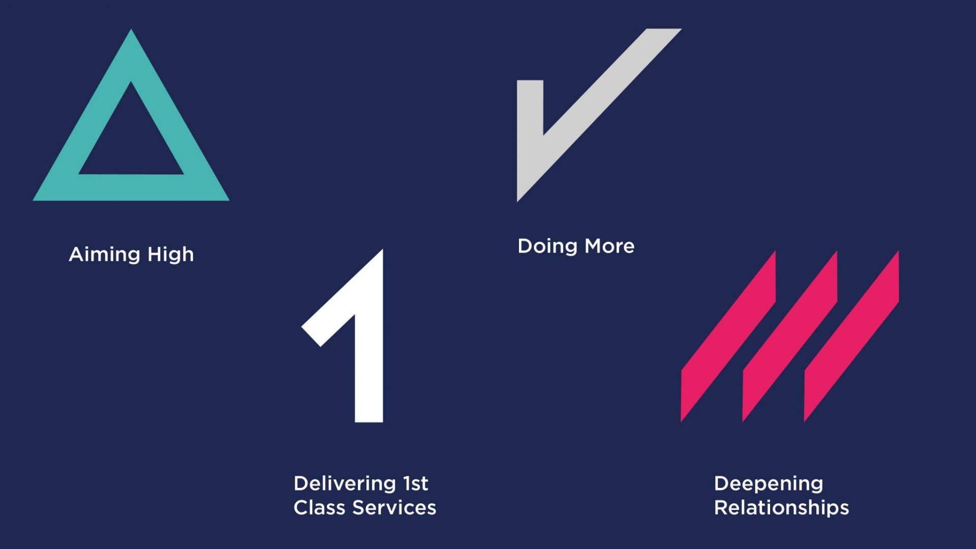
Iconography to represent their values
Zedra have values that are shaped by the past, present and future: a legacy of solid foundations, local knowledge and expertise. Their four cornerstone values are:
- Aim high
- Deepen relationships
- Deliver a 1st class service
- Do more
Using the angles that are present in the Zedra ‘Z,’ we created a unique set of icons to represent each value. We also broadened their library by adding icons relating to their story.
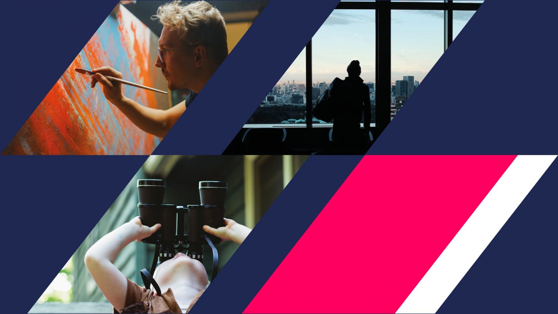
Strong visual graphics
Once we had come up with all the visual elements, it was time to apply them to a range of different assets. We used strong-angled graphics that followed the same angle of the logo to add image overlays.
We were also able to apply crops of the maze to banners, which gave even more visual impact to the brand as a whole.
Testimonial
Professional,
friendly and
helpful.
"22 Group were professional, friendly and helpful throughout the stages of our website refresh, from the initial conversations to the design and building. We received positive feedback about our refreshed website and would recommend their services."
We'd love to work with you.
We can help ambitious brands stand out and earn more with our websites and branding. Discuss a project with one of our specialists today!
Manchester
+44 (0) 161 672 7822
enquiries@22group.co.uk
26 Dale Street, Manchester, M1 1FY
Find us on Google Maps
London
+44 (0) 333 242 3990
enquiries@22group.co.uk
326 City Road, London, EC1V 2PT
Find us on Google Maps
Our partners
22 Group is the umbrella company for creative work.
Check out our specialised branches for work in the property and finance sectors: Property Stream | Finance Stream
22 Group is a proud member of The Pride, an alliance of independent creative and communications companies.
Copyright © 22 Group Ltd. 2020. All rights reserved.